Is it just me or was the beginning of 2025 an absolute whirlwind? Between a mid-week New Year’s Day, the Inauguration (which, of course, I took off to celebrate), a couple of guest appearances on podcasts (The Colorado Show and Alpha’s Make Sandwiches, check them out), the constant stream of news and happenings coming from the new Trump administration, and a bought with an energy-zapping cold, I feel like I didn’t start getting back into a normal routine until mid-February. Even then, I felt as though I was playing catch-up throughout most of March.
January is a month I usually like to take to just play with art. I don’t focus on end goal designs, but instead simply sketch or paint whatever I feel like in the moment. It is a time for me to work on skills, try out new subjects, and play with different techniques. Last year, several designs that I made later in the year had their origins in my January play. The trio of mushroom paintings, from last year, began with two sketches from January:
My “Lemons” piece is another example:
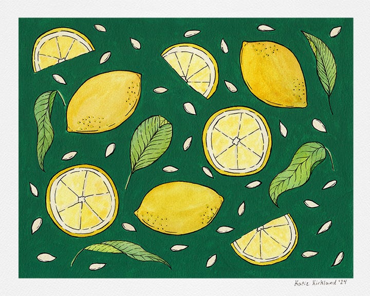
This year, I didn’t do nearly as much of this play as I had hoped to. In part, this was due to how busy January ended up being. In another part, it was because I felt a surge of motivation to design some patterns.
I’ve been wanting to get into pattern design for several years now. It’s a way to open up new revenue streams as patterns can be printed on a myriad of items and can also lead to licensing avenues. I designed a few patterns last year, mostly by repurposing elements from paintings that I sell as prints. For example, I took the above “Lemons” and used the individual elements to make a pattern with multiple variations:
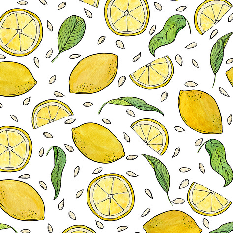
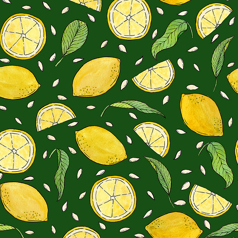
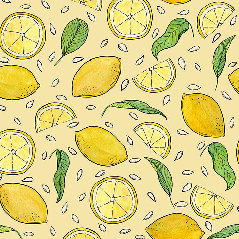
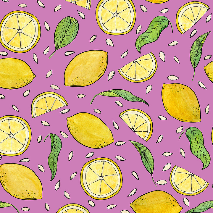
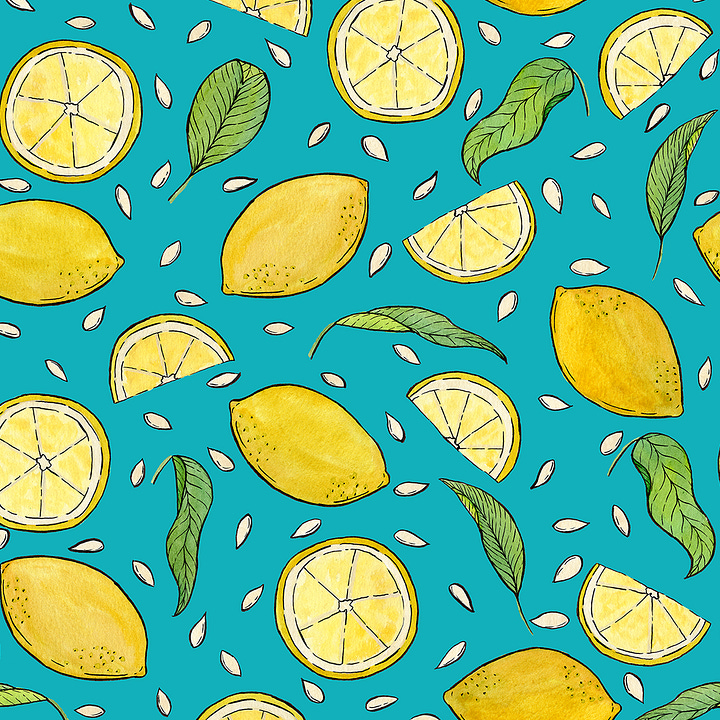
The handful of designs I made in the first half of 2024 were a good start, but as I began to develop my State Flowers series, in the latter half of the year, pattern design went on the backburner. The State Flowers series will be my main focus this year as well; in fact, I have been working on Alabama’s flower, camellia (but you will have to wait for my next art update to read about that process). However, while that series will be my main focus, this year, I don’t want to work on it exclusively.
In part, this is because it is a massive project. 50 pieces (more if I decide to also do Washington D.C and/or US territories, which I am not committing to, at this point) that so far have taken a minimum of three weeks each to produce - plus added time to get scanned, cleaned up, test prints and sticker versions ordered, and listed in my shop. Even if my timing speeds up a bit (which I hope it will), this project is still going to take years to complete and I don’t want to get burned out.
In another part, I’m looking at this from a business perspective. My State Flowers pieces have been my most popular illustrations, to date, and I anticipate that that popularity will only grow as I add more pieces to the collection. That being said, I think it is smart to have a diversified portfolio. I don’t want to put all my eggs in one basket.
Working on other projects, whether pattern design or other things, may extend the time it takes to finish the State Flowers project, but I hope it will lead to more personal satisfaction, with my art, as well as allow me to expand my art business.
The first pattern I designed this year was pretty basic, just a gingham in various colors. Gingham is probably the most simple and basic of the checks and plaids, but I noticed it is having a bit of a moment in both the fashion world and the broader design world.
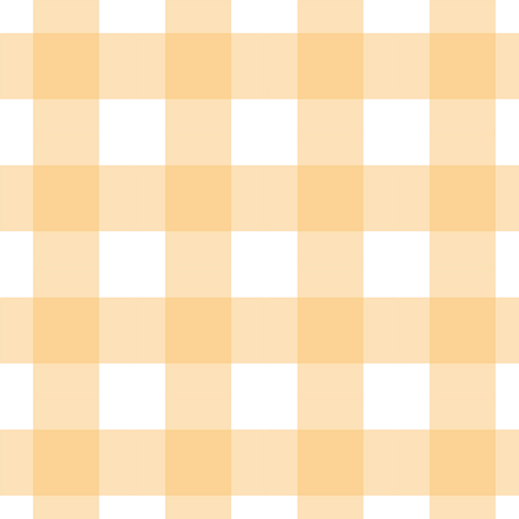
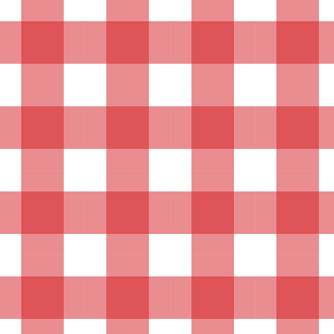
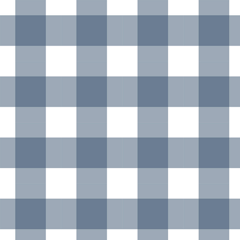
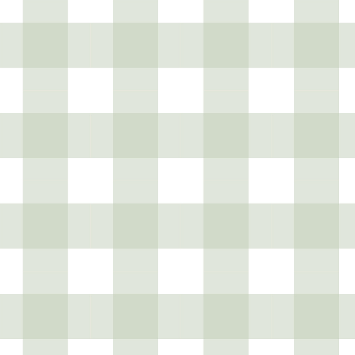
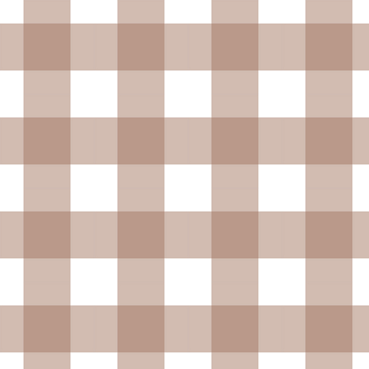
Simple and perhaps even boring as a gingham may be, sometimes I find it best to not overthink things and just to do something. Just get started. January hadn’t even finished, yet I had already added fourteen new listings (seven regular gingham and seven diagonal) to my Spoonflower shop.
Oh yes, I should probably mention, for the moment I’m designing patterns with Spoonflower products in mind. For those who are unfamiliar, Spoonflower is an online print-on-demand fabric and wallpaper marketplace that allows artists to upload their own patterns. Artists then make a small commission off of any sales made using their designs. Spoonflower allows artists to create as they please (within some modest guidelines), but they also run periodic contests in which they request designs that fit into a certain theme. Users (both artists and customers) can then vote on their favorite designs and the winners are awarded a prize (which can vary depending on the contest). One such contest led to my second pattern design of the year.
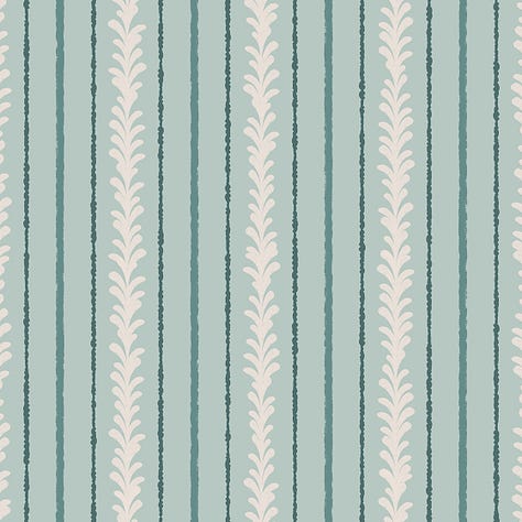
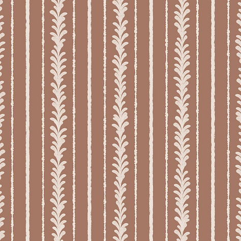
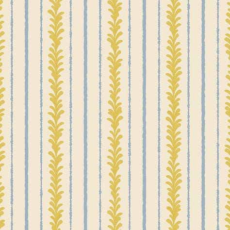
The contest brief called for “Sophisticated Stripes,” for which I submitted this design:
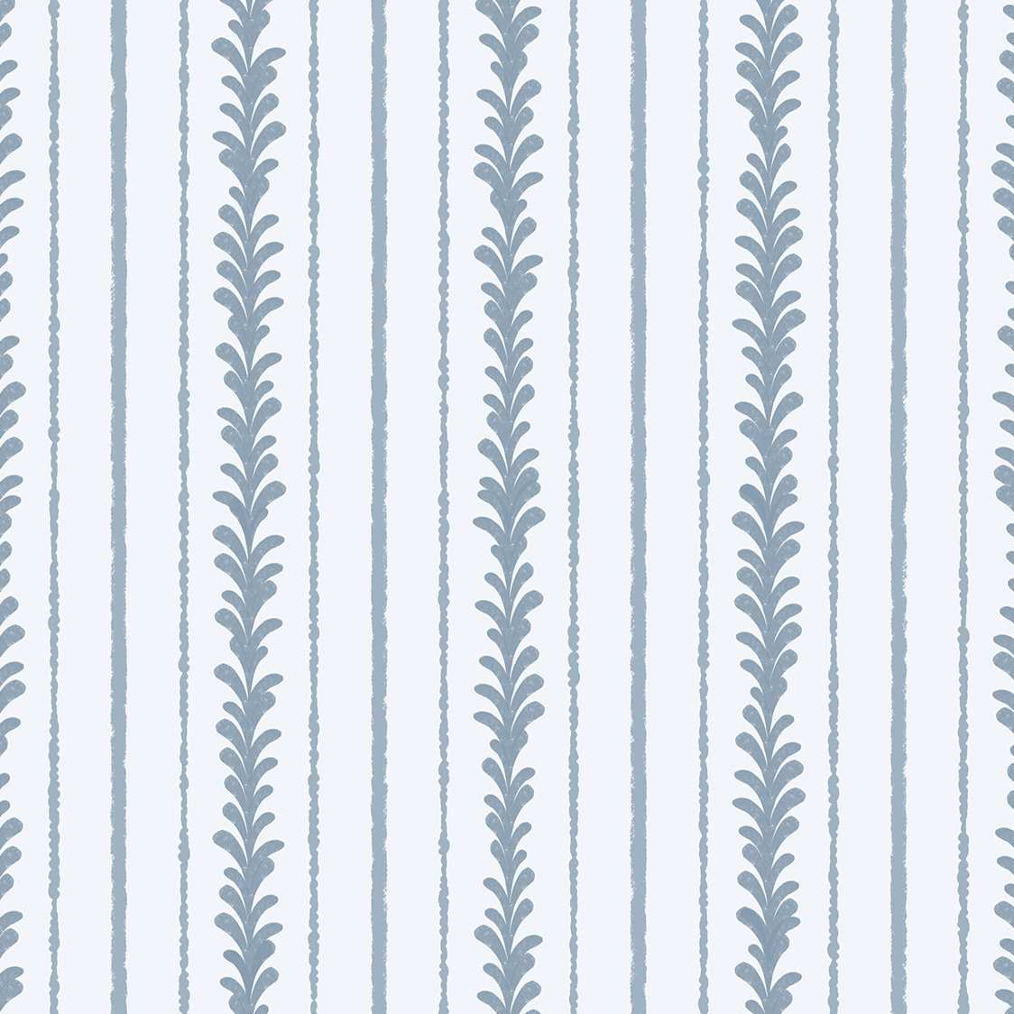
One of the nice things about pattern design (especially when working digitally) is that once the base design is complete, it is quite easy to create multiple variations simply by changing the colors. My goal is to, whenever possible, do a minimum of three color variations for each pattern I design. Here are a few I did for “Floral Stripes.”
With two relatively easy designs under my belt, I had thoroughly caught the pattern design bug and was ready to tackle something a bit more complex. Spoonflower served up an opportunity with another design challenge: paisleys.
For a moment, I balked at this, because paisleys are not my favorite design element. However, I quickly put that aside because I want to challenge myself more this year. Still, I was a bit stumped, so I turned to my old security blanket: research. I learned that the paisley likely came from Persia originally (where it was known as the buta or botah), but was made popular in the West (and got its Western name) from a town in Scotland, called Paisley, which manufactured paisley textiles in the late 18th or early 19th century. I also perused historical samples of paisley textiles in the online collections of a few museums and out-of-print books from the early 20th century for inspiration. It turns out there is more variation to the paisley motif than I had originally thought.
In the end, I decided to go with a filigreed look that blended Eastern and Western influences. I’ve been enjoying the Indian-inspired block-print trend, which has been growing over the last few years, so I decided to incorporate that look into my final pattern.
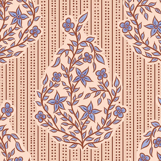
What started out as something that I thought was necessary to do, but not something I was particularly excited about, turned out to be a really enjoyable experience. I’m quite happy with the final pattern and its color variations. It also snagged me two pattern designs for the price of one when I realized that the stripes and dots behind the paisleys could be repurposed as their own pattern.
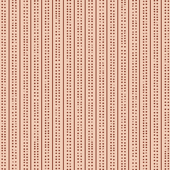
Next up was another Spoonflower challenge: Heritage Revival. This one was a bit broader than the other two, which asked for specific motifs. As the name suggests, the Heritage Revival challenge asked designers to create patterns inspired by historical designs. My mind immediately leaped to the turn of the century Arts and Crafts movement.
Even though I honed in on a general idea quite quickly, I actually struggled to come up with a composition until the night before the design was due. I ended up working until almost the last minute and went with a more simplified coloring than I originally envisioned.
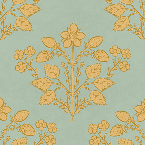
Of course, I will still do a version with my original vision for the color, but I’m still quite happy with the version (and its color variations) that I pulled together in under 24 hours.
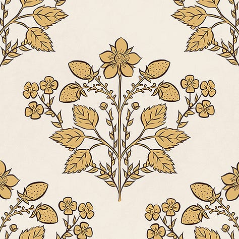
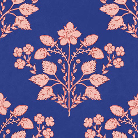
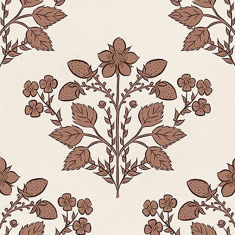
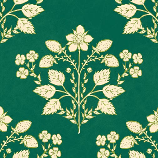
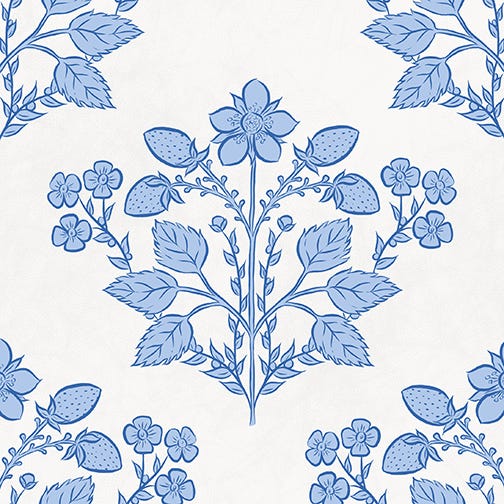
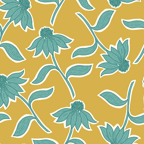
The final Spoonflower contest, that I entered during this time period, was called “Bold Florals.” For this one, I designed a pattern featuring coneflowers. I’ve noticed that daisies and similar flowers are trending, so I thought this would be a good way to incorporate that trend into one of my designs. I then played around with bold, summery colors for the different variations.
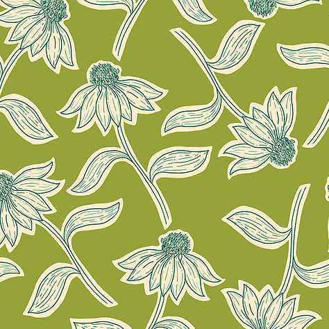
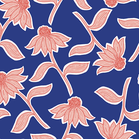
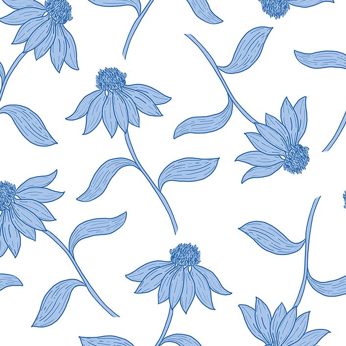
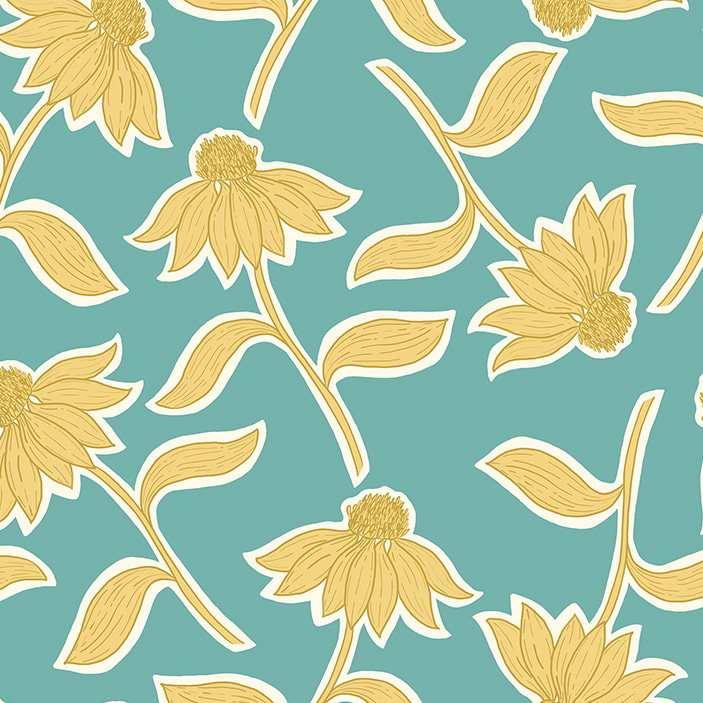
As of yet, I haven’t won any contests, but that’s ok. At this point, I don’t really expect to. While I am very happy with my designs, I know I still have a lot to learn before I create something that will win a contest. But even without winning, participating in these design challenges has its benefits. For one, a lot more eyes see those designs. Indeed, the versions of each pattern that I submitted have received far more likes than any of my patterns that were not submitted to challenges. Additionally, Spoonflower is motivated to sell more products, so these challenges are meant to bulk their catalog with designs that people want to buy. By participating in these challenges, I know I’m creating patterns that reflect current trends and customer demand.
That being said, participating in these challenges has had other benefits when it comes to my personal growth as an artist. They’ve given me the confidence that I can tackle motifs and styles I would have shied away from before, for fear of them being outside of my range of skills.
I think the number one lesson I’ve learned from this (one that I’ve learned before, but for some reason need to be constantly reminded of) is that sometimes you just have to get started. It is so easy to get stuck overthinking a new project; to become overwhelmed by all that will need to go into it. Sometimes the best course of action is to stop overthinking it and instead put your pencil to paper (or stylus to tablet) and start sketching.
More than once, over the past couple of months, I’ve gone into a challenge not knowing with at best a vague idea of what I would create. I would be stuck in a kind of paralysis, not knowing what I should do until I got out my sketchbook and just started doodling. So even though I didn’t get the same January play experience that I’ve had in the past, I still found a way to incorporate that concept into my pattern designing process.
If you’re interested in any of the patterns featured in this article (or want to see more variations of them) you can check out my Spoonflower shop here. Also, I’m trying to think of a better name for this series than “Art Update.” If you have any ideas, drop them in the comments. Thanks for reading!


